Visualizing subjective well-being
October 17, 2024

For decades, economic indicators like GDP have been the primary measure of a country’s progress. But do they truly capture how people feel about their lives?
Subjective well-being provides an alternative perspective—one that considers life satisfaction, emotional experiences, and overall quality of life. It helps us understand whether economic growth translates into better lives for individuals or if crucial aspects of well-being are being left behind.
I first encountered this topic while working on a data visualization project for the Catalan government, aimed at communicating well-being data. Before that, I had never thought deeply about it, but exploring the data sparked my curiosity. How had something so fundamental never crossed my mind? It makes perfect sense to consider subjective experiences when measuring societal progress, yet we are so anchored to traditional indicators that we often overlook the obvious.
This project led me to discover a fascinating book, En defensa de la infelicidad by Alejandro Cencerrado (in Spanish). If you’re interested in the topic, I also recommend this introductory article on subjective well-being, which includes a wealth of useful references.
How Do We Measure Well-being?
Unlike GDP, which is based on economic output, subjective well-being is measured through surveys. In our project, periodic surveys provided not only a snapshot of well-being but also trends over time. The data is segmented by socio-demographic groups, allowing us to analyze differences based on age, gender, income, and employment status.
Making Well-being Data Accessible
Understanding well-being is one thing—communicating it effectively is another. Our first challenge was how to explain the concept and key findings to a general audience. To address this, we initially designed a storytelling website (in Catalan) that focused on making the data engaging and accessible. It was well received, garnering mentions in mainstream media.
Building on that success, we took on a more ambitious goal: showcasing a much larger portion of the survey data, incorporating trends over time, and integrating studies conducted using the data. We also aimed to provide open access to all of the information collected. The result is the Observatory of Subjective Well-being in Catalunya, an interactive platform designed to explore and understand well-being data in depth.
Let’s take a look at some of the key features.
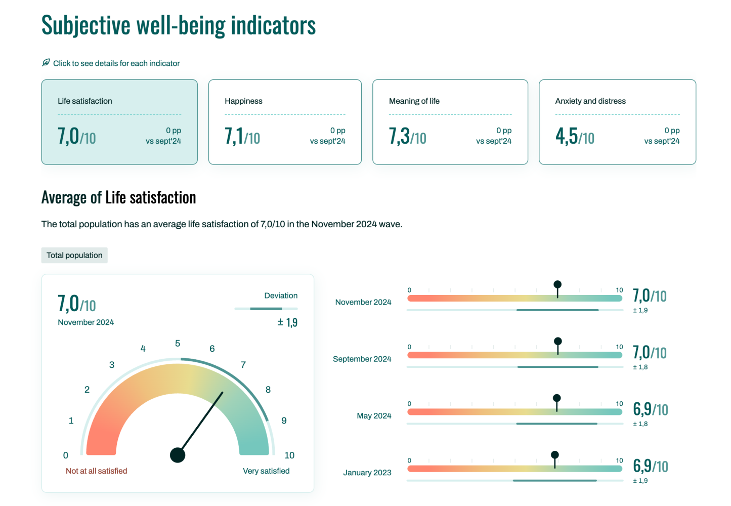
Well-being KPIs: A Snapshot of Well-being
The website presents the main well-being indicators in a dashboard-like format, highlighting key numbers and trends. One of the central visual elements is a “thermometer” that displays both the average and the standard deviation.
Personally, I have reservations about using averages, as they can oversimplify complex data. I would have preferred a visualization that better conveyed the distribution of responses. However, given the need to communicate to a wide audience, using averages made it simpler. Finally, including standard deviation was a compromise that helped address my concerns.
Dashboard view of the main subjective well-being indicators
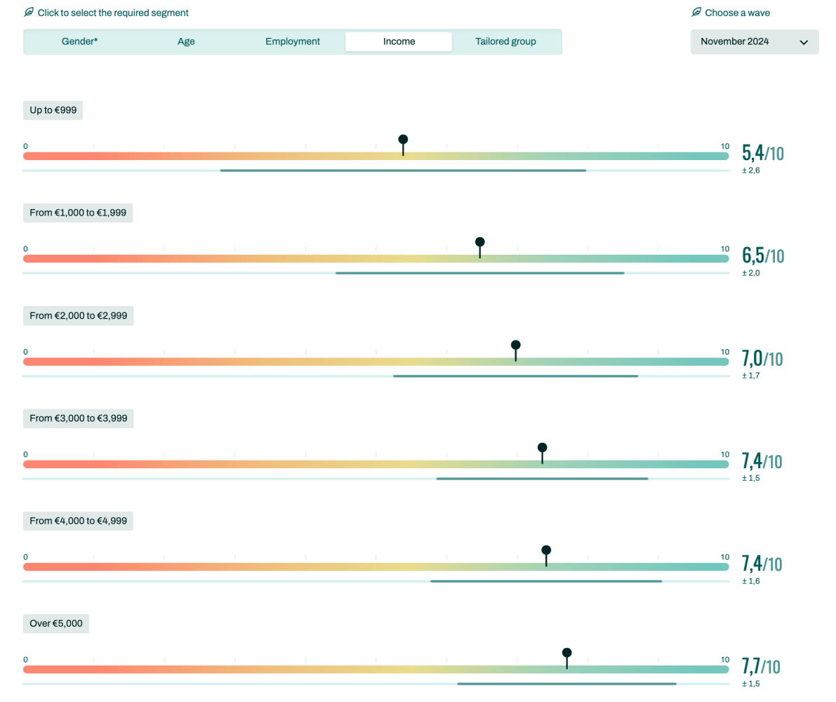
Readers can also segment the data by different socio-economic groups to explore how well-being varies across gender, age, and income levels. A classic finding in well-being research is the relationship between income and life satisfaction: while a low income strongly correlates with lower well-being, beyond a certain threshold, additional income has a diminishing impact.
The influence of income on well-being; showing both average and deviation
What Drives Well-being?
Beyond measuring well-being on a 0-to-10 scale, a crucial question is: What factors influence well-being the most?
This is where one of my favorite visualizations comes in. For instance, young people (18–19 years old) tend to value having a “purpose” and a fulfilling “personal life” far more than “health” or “financial stability,” which are key drivers for most of the population.
A circular chart showing the importance of different factors to explain well-being
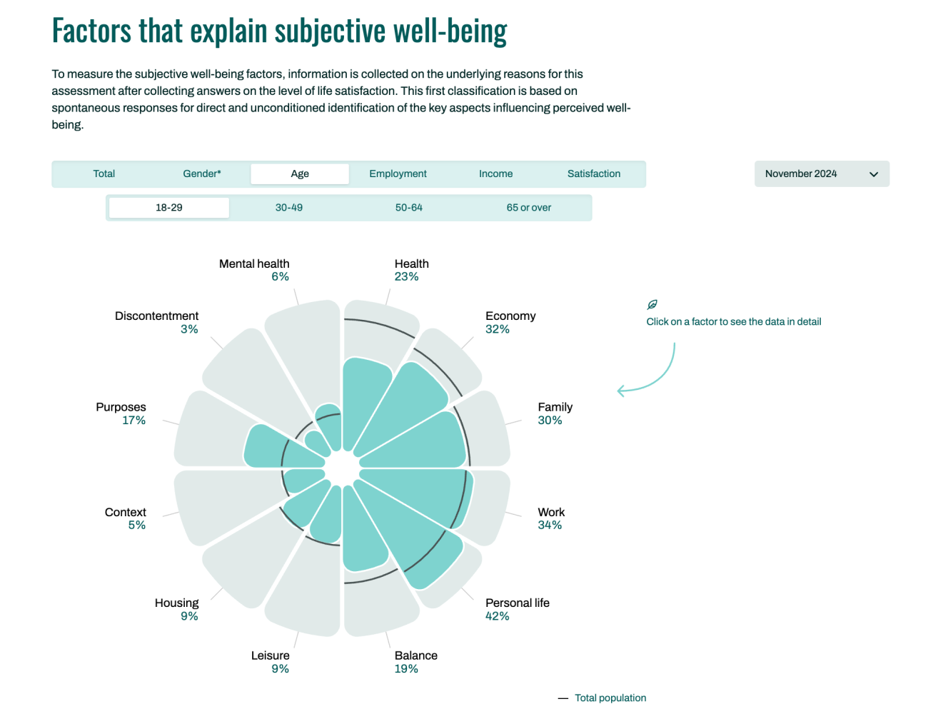
I am particularly fond of this circular visualization. It effectively condenses a vast amount of information and makes it easy to switch between socio-demographic groups to compare data. Traditional bar charts are often considered more “accurate” for comparing differences, but here, our goal was to highlight broad patterns while making the data visually engaging.
Interestingly, this visualization became one of the most recognized features of the project. Internally, the team even started referring to it as “the mandarine”, and it became an emblem of the initiative.
Sometimes, we rely too heavily on conventional charts and forget that alternative visual approaches can be just as effective—if not more so—in making data accessible to a broader audience.
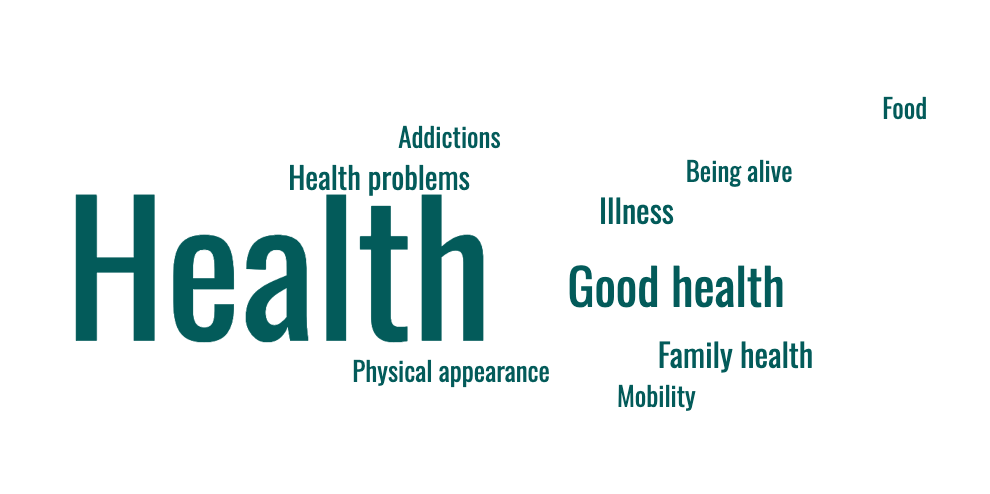
Understanding the Factors in Detail
Clicking on any well-being factor reveals a deep dive into the underlying data.
First, we provide qualitative data, capturing how people interpret each factor. For instance, “health” can mean different things to different people—some equate it to simply “being alive,” while others associate it with “family health,” “diet,” “addictions,” or “physical appearance.” These nuances are crucial in understanding why a given factor influences well-being. Without this context, we risk losing valuable insight into the real meaning behind the numbers.
Tag cloud showing concepts that people relate to "Health"
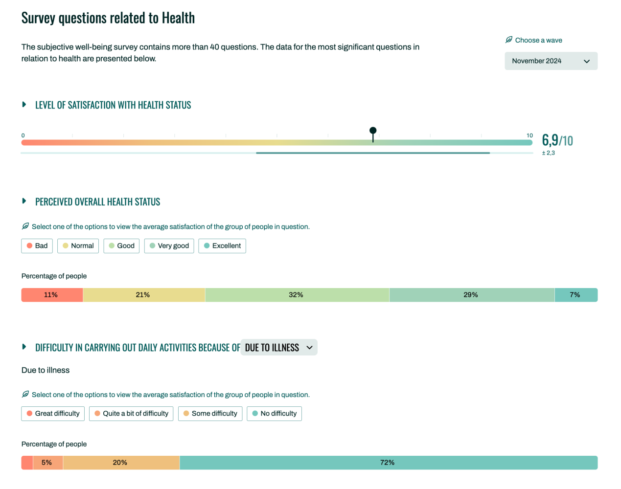
Next, we present quantitative survey data related to each factor. This allows us to analyze extra data and details related to each factor.
More information about aspects related to health
Continuing with the example of "health", one particularly insightful comparison is the link between physical pain and life satisfaction. As expected, individuals who suffer from chronic pain report significantly lower well-being. While this may seem obvious, having quantifiable data on the subject is essential—it enables comparisons with other factors.
The following visualization shows that. Not only we can understand the % of people with different levels of "pain", but how each level directly relates to life satisfaction.
How particular aspects influence life satisfaction; in the image, the influence of "Pain"
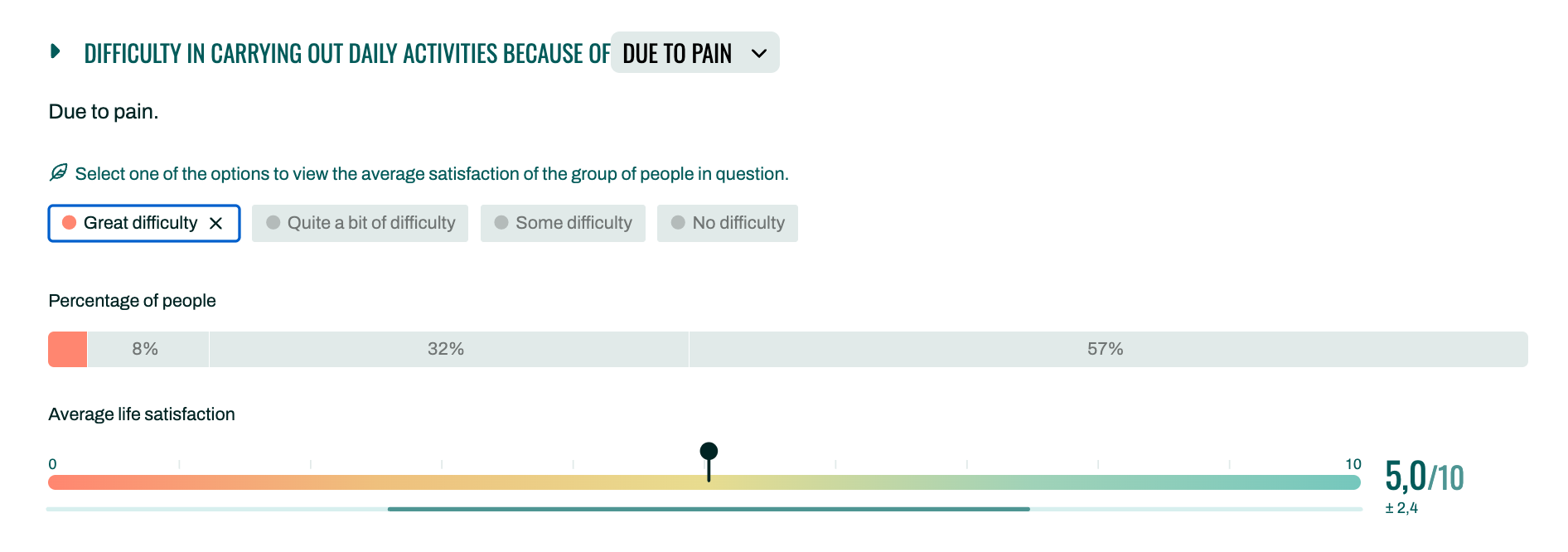
For instance, the impact of disability on well-being appears to be lower than that of pain. This suggests that society has made progress in supporting people with disabilities, while pain management remains an area requiring more attention.
This is the real power of measuring subjective well-being: it helps identify which factors most influence life satisfaction, enabling policymakers to design targeted interventions. GDP alone will never capture how pain, addiction, or other deeply personal experiences affect a society’s overall well-being.
Final thoughts
Exploring subjective well-being has been an eye-opening experience for me. It’s a reminder that, beyond economic figures, a thriving society is one where people feel their lives are meaningful and fulfilling.
I encourage you to explore the Observatory of Subjective Well-being in Catalunya and share your thoughts.

Chief Strategy Officer
Pere founded OneTandem to do what he likes the most: helping companies, organizations and people transform data into knowledge. He has more than 15 years of experience in the data field, working with all kinds of clients and teaching at universities and conferences around the world.
Liked it? Share it!