Projects
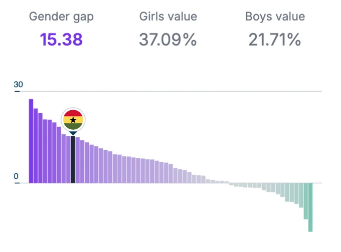
Pop Council - Africa
A data storytelling that illustrates the challenges faced by adolescent girls in Africa.

European Innovation Scoreboard
An interactive website for the European Commission that allows users to explore the European Innovation Scoreboard, the Regional Innovation Scoreboard, and the Eco-Innovation Index.
Find
A website to explore the Pathogen Diagnostics Readiness Index and guide investments for future diagnostic technology.

Wellbeing Index of Generalitat de Catalunya
A data storytelling and exploration website to visually communicate and explore the results of the wellbeing survey.

WEF Nexus Index
Website to explore the availability and access to water, energy and food across the world.

Gobierno de España
An interactive website that shows the results of a big data study from Ministerio de Movilidad y Transportes on mobility patterns in Spain, specifically towards ski resorts.

InfoGovern
A data portal to integrate all the datasets about government action and programmes.
SPOTT
A platform to evaluate and compare the ESG (environmental, social and governance) disclosures of major global companies in the palm oil, natural rubber, and timber and pulp sectors.
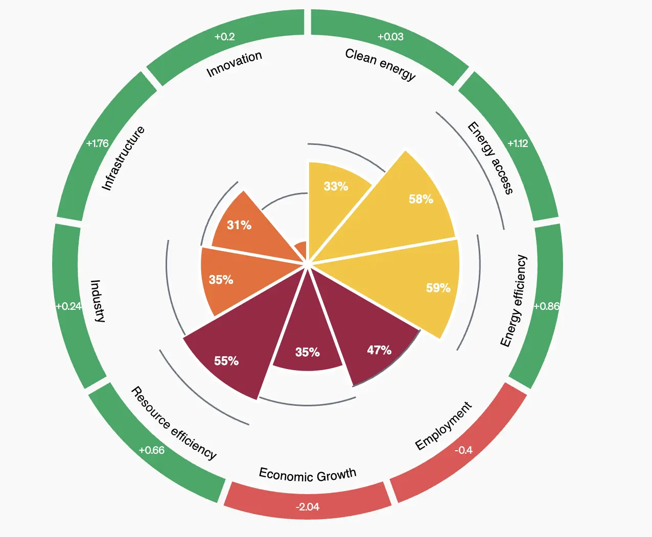
The Industrial Development Report
An interactive website for the United Nations to communicate the latest trends and developments in industrialization based on the IDR 2024.

Innobasque
A data portal to to communicate the most important data on R&D and innovation in the Basque Country

Dibaròmetre
An exploratory data visualization presenting insights from a survey on citizens' perceptions of municipal services and administration in the province of Barcelona.
Pop Council
Adolescent Atlas for Action. A data portal to show all research and data available for adolescents across the world.

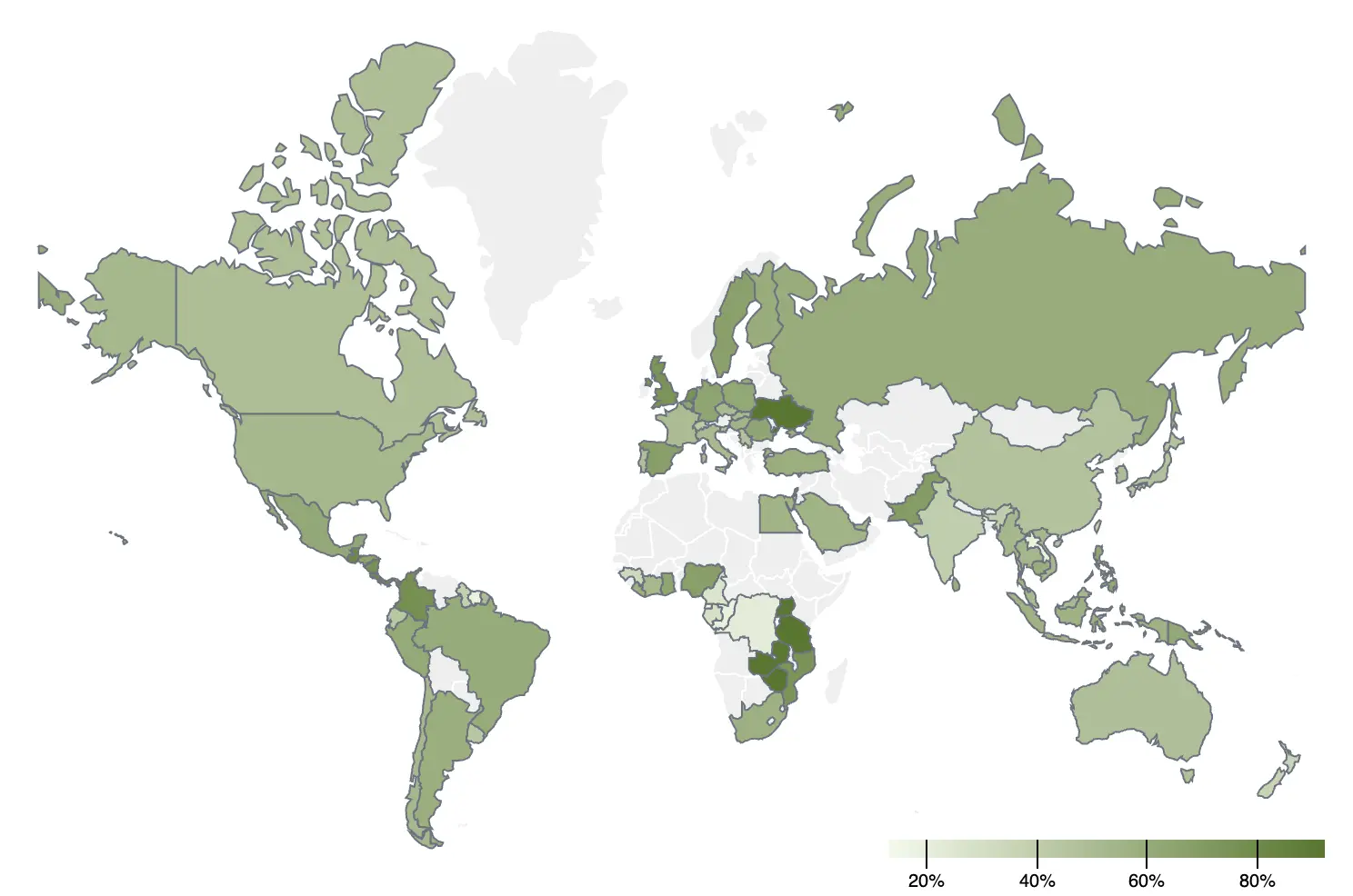
SDG Index
Sustainable Development Report website for exploring and communicating the SDGs across all countries of the world.

The QI4SD Index
A data portal for the United Nations, to explore SDGs relationship to quality infrastructure

Visualization and Time - Data Visualization Society
Interactive storytelling to communicate the results of The State of the Industry Survey about how data visualization professionals spend their time.

WIPO
A website to explore data related to the Global Innovation Index, based on the research by the WIPO and associated organizations.

Fecyt
App for the presentation of scientific indicators

Odismet ONCE
A website to communicate and explore the results of the EDAD survey on disabilities. The website complies with WCAG 2.1 accessibility standards

Mobile World Capital
A website to communicate and explore the results of a research project about digital inequality.

Citibeats
Data portal to communicate the results of the active listening study on concerns expressed by citizens online in different countries.